PUMAdb : Data Analysis and Clustering Help
Your session is inactive. Login
Contents
- Description
- Partitioning Data
- Distance Metrics and Centering
- Correlated Genes
- Image Generation Options
- Visualizing Clustered Microarray Data
Related Help Documents
- Data Selection for Analysis: Explanation of the steps involved in selecting and filtering data for clustering
- Analysis Methods: Information about the algorithms used for hierarchical clustering and Self-Organizing Maps (SOMs)
- File Formats: Information about preclustering (.pcl), clustered data table (.cdt), gene tree (.gtr) and array tree (.atr) files generated in the process of clustering data
- Cluster and TreeView Manual from Michael Eisen at Lawrence Berkeley Laboratories
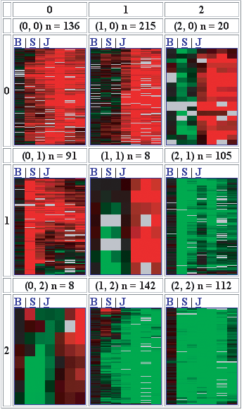
Self-organizing maps (or SOMs) were developed by Tuevo Kohonen in the 1980s and have since been used to analyze microarray data. The implementation of SOMs in PUMAdb allows the data to be separated into partitions that are aranged in a two-dimensional grid. For example, Figure One shows a 3 x 3 map with nine partitions. Notice that each partition is more similar to its neighbors than it is to the partitions that are farther away. The implementation of SOMs in PUMAdb has several steps: initialization of the SOM, refinement of the SOM, partitioning of the genes, and hierarchical clustering of each partition.
To use SOMs, you must first specify the x and y dimensions of the map. This will not only determine the number of partitions you use (a 2 x 3 SOM has six partitions) but since a partition is affected by its neighbors, the numbers of neighbors a partition has affects the results as well. For example, a 1 x 6 SOM will quite likely look different from a 2 x 3 SOM. PUMAdb currently has no facility to optimize the number of partitions and their geometry, see Robert Tibshirani, Guenther Walther and Trevor Hastie, Estimating the number of clusters in a dataset via the Gap statistic. for further discussion of this topic.
To initialize the SOM, a random vector is
assigned to each partition. This vector is not truly random (the same
random vector will be used if you subsequently analyze the same
dataset over and over), unless you select the Randomize seed
option. It can be useful to use this option to determine how stable
your SOMs are. The dimensionality of the "seeding" vector is
determined by the number of experiments you are using. For example,
if you are analyzing data from 12 experiments, you can imagine that
each gene's expression pattern can be represented as a 12-dimensional
vector. At this step, the vectors in each partition have no
relationship to each other. In other words, the map is unorganized at
the start.
Once the SOM is initialized, a gene from your list of genes is picked
at random and its pattern is compared to each of the vectors in the
partitions. Once the closest match is identified, the matching "seed"
vector is modified slightly, to make it more closely resemble your
gene vector. In addition, neighboring partitions are also modified
(to a lesser degree) to make them more closely resemble your gene
vector. This process (randomly selecting a gene, finding its closest
match, modifying the matching and neighboring seed vectors) is
repeated 100,000 times.
As the iteration number increases, the amount by which the matching
vector, as well as the neighboring vectors, is moved decreases. In
addition, the definition of a neighboring partition becomes more
stringent. You can visualize this as a circle drawn around a
partition. Partitions within this circle are neighbors. At the
beginning of the refinement process, the circle is very large. As the
number of iterations increases, the diameter of the circle around each
partition decreases, so that each partition has fewer and fewer
neighbors and subsequently has less and less effect on the values of
the vectors that represent other partitions.
Eventually, the map will settle down to one that changes very little
with each iteration. A partition will be more similar to its neighbors
than it will be to more distant partitions. In this way, the map
becomes organized.
After the 100,000 iterations have occurred, the genes from your data
set are assigned to a partition. This is accomplished simply by
identifying the partition whose vector most closely resembles the
vector for each gene. In PUMAdb's implementation of SOMs, a gene can be
assigned to one and only one partition. Because it is theoretically
possible for a partition to contain all genes or even no gene, some
partitions may be empty or nearly so when there are few genes or few
experiments. Each partition is then hierarchically clustered. PUMAdb then displays the
SOM result as depicted in Figure One.
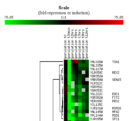
Figure One: A three-by-three SOM of microarray
data. Note that each partition more closely resembles nearby
partitions than it does distant partitions. Also note that genes are
assigned to each partition unequally: some partitions have more genes
than others.
As shown in Figure One, each partition has an x- and y-coordinate, in this
case both range from 0 to 2. The number of genes assigned to each
partition is shown at the top, For example, the first partition (0,0)
has 136 genes assigned, while the middle partition (1,1) has only
eight genes assigned to it.
For a description of the different methods and tools for looking at
your SOMs, refer to the Visualizing Clustered
Microarray Data section.
The most obvious method for comparing sets of microarray data is to compare the data profiles. A gene expression profile can be imagined as a vector of n dimensions, where n is the number of microarray measurements for that gene and whose coordinates are the results of each measurement of that gene. By comparing these vectors, we can detect which genes show similar data profiles across a series of experiments. Similarly, experiments can be thought of as vectors of m dimensions, where m is the number of genes and each coordinate is the measurement of a single gene on that microarray. Comparison of the array vectors will show which arrays showed the most similar behavior. Once we consider these data as vectors, we can use standard mathematical techniques to measure their similarity. PUMAdb uses two distance metrics to measure the similarity between vectors: Pearson Correlation and Euclidean distance. Pearson Correlation treats the vectors as if they were the same (unit) length, and is thus insensitive to the amplitude of changes that may be seen in the expression profiles. The Euclidean distance measures the absolute distance between two points in space, which in this case are defined by two vectors. Note that Euclidean distance will be affected by both the direction and the amplitude of the vectors, so that two genes that are coordinately expressed might not be seen to be similar if one has a much higher signal than the other.
Since the Pearson Correlation is the one most often used, this document covers it in greater detail than Euclidean distance. The Pearson correlation can be computed as follows:
| Equation 1 |

|
|
| Equation 2 | where :

|
In equation 1 S(X,Y) is identical to the textbook Pearson Correlation if Goffset in equation 2 is set to the mean of the observations. We refer to this as the Pearson Correlation centered metric. Alternatively, Goffset may be set to other values. For example, it is set to zero (corresponding to a fluorescence ratio of 1.0) when calculating the Pearson correlation of uncentered metrics.
Centering data before clustering and choosing whether to use a centered metric during clustering will have significant effects on how your data cluster or how your clustered data look. For more information about how to center data prior to clustering, refer to the Data Selection for Analysis help document. Figure 2 shows an example of the same data clustered three times using different combinations of centering and distance metrics. For this example, a small dataset was duplicated, but a constant value was added to the second copy of the data.

In the first panel of Figure 2, the data are uncentered and an uncentered metric was used during clustering. Note that because the constant was added, the same genes very rarely cluster together. In the second panel, the data were centered before clustering with an uncentered metric. Since the average of all data for a gene was subtracted from each value, the centered data are exactly the same for each member of a pair of duplicated genes. Centering the data has completely eliminated the effect of the constant value that was added. In fact, you cannot tell by visual inspection which member of a pair has the added constant. In the third panel, uncentered data were clustered using a centered metric. The duplicated genes still cluster together (just as they would if the data had been centered), but the visual display shows you which genes have the increased values.Figure 2. Examples of clustering with different methods of centering.
You can make a list of genes with well correlated data profiles within your dataset. Choose an upper limit of the number of genes to display, the correlation threshold and the method of correlation (either centered or non-centered). Unless you have used gene filters (for example, "Only use genes with greater than 80% good data") during Data Selection for Analysis, you should be aware that genes with only a single datapoint will be well-correlated to all other genes. The list of correlated genes is available for downloading and ends with a ".stdCor" extension.
Entering a higher number for the contrast will result in a less sensitive coloring scheme in the resulting cluster image. Only very highly expressed or repressed genes will be brightly colored. Entering a lower number will result in a more sensitive coloring scheme, with dramatic differences being needed for a bright colored spot.
Missing data or data that did not meet filtering criteria will be made gray in the cluster image. You can select the shade of gray you wish to display.
You can select to view your clustered with either the red/green color scheme or a blue/yellow color scheme, which can be easier to see by people who are red/green colorblind.
You can the images of the spots on the arrays with your clustered data. This can be convenient for assessing data quality, but retrieving the spots can make your job take longer.
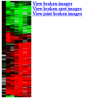
After the data have been clustered, you will be presented with an image
with a list of links. There are several options for visualizing and
exploring your clustered data. An example of the image is shown in
.
By clicking on the image itself, you can explore your data, zoom in,
zoom out and more.
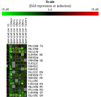
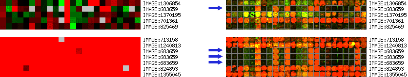
Spot images are simply square images with even signals that represent
the actual spots on the array. It is often more convenient and
intuitive to examine the broken images rather than the spots
themselves. Figure 4 shows an example of a broken images.
You can view your clustering results as images of the actual spots, as
illustrated in Figure 5.
Figure 6 shows how you can see both the images and the spots in your
clustering results.
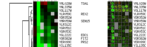
When several instances of the same clone (SUID) are present on the same slide
and data points are collapsed by SUID, this will result in averaging
of these data points. Subsequently, when spot images are displayed during
clustering, the images from one of the spots is picked
randomly. Naturally, this might look quite different than the averaged
cluster images.
When planning on looking at spot images during clustering, the
"Include SUID/LUID/SPOT in the UID column." box has to be checked
during data retrieval. If this is left unchecked, the spot images can
not be properly assigned to cluster images when multiple instances of
the same clone (SUID) are present on the slides. A random spot image is
picked and will be used for all spots. An example is shown on Figure 7.